






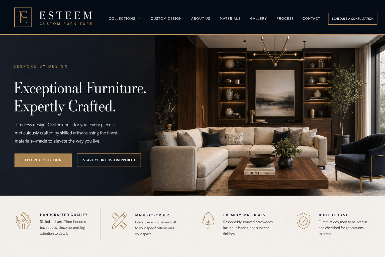
Design vs SEO and Answer Engine Visibility
By Scot Noel, Director of Content Strategy and Development
At Chroma Studios, we know that when a client comes to us, they expect a beautiful website. Our designers are talented. Our portfolio proudly displays their work, and for everyone involved, color, layout, and use of the best marketing images is a result that is easy to see, easy to evaluate.
Design is not only what everyone sees first, it is what everyone spends their time getting right. The client, after all, is the gatekeeper of both approvals and money. The owner has to love it, and all other opinions bend in that direction.
There’s a cost for that. Often, what looks to the owner like money well-spent is probably not even in the best-interests of the client’s company. But the other stuff, the stuff that helps their website get found online by Google, by A.I., and finally by customers may not only be absent from the beautiful design — it might be entirely incompatible with the beautiful design.
That’s harsh, but true. And the elements that can make a website convert customers are often antithetical to the owner’s sense of what’s going to put their company in the best light.
So, let’s get into it. This is not an argument against beautiful websites. It’s an essay on understanding how things work on the modern internet and the role your website has to play. For those who want to know “why doesn’t my beautiful website bring in any business,” what follows may help you understand the problem.
Your Website Serves Four Masters
Your website answers to four demands, and they do not want the same things.
Your brand wants the site to look like you. Your company colors, your typography, your personality, the feeling someone should have about your company before they have read a word.
Search engines (like Google) want a page that loads quickly, reads as text, and answers customer questions clearly enough to be worth showing to someone.
Answer engines (ChatGPT, Claude, Perplexity, Google’s AI summaries) want something quite different: informational content a machine can lift out of your page without running a browser.
And accessibility standards, along with the human beings those standards exist for, want a site that can be perceived and operated by someone who cannot see it, cannot use a mouse, or cannot tolerate motion on a screen.
Believe it or not, these four pressures all exist to help humans quickly find the information they need to make decisions about contacting you and buying your services. They do not exist to make sure your site is “pretty” and that the owner likes what he or she sees.
That said, I’ll stress one more that that we’re not advocating for ugly websites. Just that there is a lot to designing a clean, fast, well-labeled page that has any hope of satisfying all of these forces at once.
“The question is not whether your website is beautiful. It is whether it still works when a machine reads it, a screen reader announces it, and a phone on one bar tries to load it.”
The Web Is Getting Prettier and Harder to Use
WebAIM, the accessibility institute at Utah State University, has scanned the home pages of the top one million websites every year since 2019. It is the closest thing our industry has to an annual physical. For six straight years the results improved, slowly. The 2026 report reversed the trend.
They attribute the regression to home pages growing larger and more technologically complex at an accelerating rate. The web got more ambitious and less usable at the same time, and it did so while nearly everyone involved believed they were making things better.
For the last seven years, roughly 96 percent of all detected errors have fallen into the same six categories: low-contrast text, missing alt text, missing form labels, empty links, empty buttons, and a missing document language. This is not an exotic engineering problem. It is the same half-dozen mistakes, made over and over, mostly in the service of a look that made the owners and the designers happy.
Why should you care? Because WebAIM measures things that can get you sued when a person with disabilities finds your website unusable. And when that happens, you won’t win. You’ll pay, you’ll be forced to redesign your website anyway, or both.
When Beautiful Is Slow
Start with what’s called the hero. Whatever sits at the top of your homepage. It could be a full-width video, the enormous photograph, the slowly rotating slideshow. It is usually the largest thing on the page, which means it is usually the thing Google is looking at first.
Google’s Core Web Vitals are three thresholds, easier to understand than their names suggest.
- Largest Contentful Paint asks how long until the biggest visible element finishes loading.
- Interaction to Next Paint asks how fast the page responds when someone taps something.
- Cumulative Layout Shift asks how much the page jumps around while loading.
All three are measured against real visitors in a way that makes how fast the site feels on your office Wi-Fi irrelevant.
A large hero image is not automatically a mistake. An unengineered one is. Getting it right can be difficult, time-consuming, expensive (go back to time-consuming), and fall short of everything you hoped for when you wanted a 4K video tour of your company to be the first thing a web visitor saw.
But that probably wasn’t in your best interest anyway. Research has repeatedly shown that visitors often miss a homepage’s biggest offer because it sat inside a rotating image slot, a video, or the home page design overwhelmed it.
When Your Content Is Not Really There
Stated simply: text baked into an image is not text. If your service list, your price sheet, your tagline, or your beautifully typeset quote card exists only as a picture, search engines cannot read it, AI systems cannot extract it, and a screen reader announces nothing at all unless someone wrote alt text that reproduces it exactly.
That is a triple failure produced by a single aesthetic decision — usually the wish for custom typography that web fonts would not deliver. WebAIM found missing alt text on 53.1 percent of home pages. So, you’re not alone.
The harder version of the problem is JavaScript. A great many modern sites are built to feel like apps: the page arrives nearly empty and the content is assembled in the visitor’s browser a moment later. Google renders JavaScript and will generally see that content. AI crawlers are a different story.
In December 2024, Vercel and MERJ published an analysis of more than 500 million crawler fetches and reported no evidence that major AI crawlers, including GPTBot, executed JavaScript. As a result, a site that ranks well on Google can still be largely invisible to ChatGPT, Claude, and similar systems if its content exists only after client-side rendering. There is simply nothing useful in the initial HTML for those crawlers to read.
And reading is what the new A.I. Chatbots do, including Google’s. They want factual, informative data that helps customers make decisions, and they want a lot of it. You may think that people don’t read and that having a lot of information on your website is useless and turns people away. That would not be correct.
The people ready to put down money actually do read a lot, and the new A.I. answer engines want to deliver exactly what those people need to read as efficiently as possible.
“We treat you like family and we have a great reputation.” is good to say, but people are looking for relevant facts: “Your project will be under way within 3 days, the estimate is $1,200, and our warranty is…”
When There Is Nothing to Find
Content is so important so underrated by website owners that it is worth another section to make sure the lesson lands. The elegant page with forty words on it is absolutely useless on all fronts.
Enormous type, acres of space, one photograph, one sentence of atmosphere. It is genuinely beautiful, and to a machine trying to answer somebody’s question, it is empty. To tell the truth, your potential customers don’t appreciate it much either.
Answer engines assemble responses out of passages that plainly answer something, and a page that is all mood supplies none. That doesn’t mean you have to write a book for every page. The failure is vagueness, not length. But we should say a few words about length.
Word count itself is not a ranking or citation factor. A short page that fully and specifically answers what customers ask can outperform a long page of atmosphere and vagueness. The failure is lack of useful, extractable information—not length. A tightly focused page that supplies clear facts will serve both search engines and answer engines better than thousands of words of generic mood. (I tend to want all informational pages to serve at least 300 words, and SEO plugins like YOAST tend to support this.)
There are structural rules too. A one page site of all text that tries to lay out everything your company does (even if tightly written and precisely information) is a mistake. The answer engines will pick one thing and ignore the rest, because it will seem like a jumbled mess— pages torn out of dictionary instead of a recipe.
Then there is pricing, which is not strictly a design decision but arrives in the same conversation. When a buyer asks an AI assistant what something in your category costs, the assistant answers from whoever published a number. Your silence does not read as premium or bespoke. It reads as no data, and a competitor’s figure fills the space along with whatever framing came attached to it.
Pricing can be a controversial decision. You don’t want your competitors to know what you charge; your service has complexities and numbers are hard to provide without a discussion, etc. It’s all valid. You should simply keep in mind that the company willing to publish prices will win in the answer engine competition online. People ask for prices more than anything else, and the answer engines will find the companies willing to say it out loud.
There is a middle ground most businesses never consider: published ranges, a “projects typically start at” figure, or a financing page that shows the shape of the investment without committing to a number.
“Silence about your pricing does not read as premium. To an answer engine, it reads as no data — and it will use your competitor’s number instead.”
When Your Brand Colors Are the Problem
Honestly, your brand palette was probably chosen for print: a sign, a truck wrap, a trade show banner. These were company color and design decisions made under different constraints, by people solving a different problem. A surprising number of those palettes do not survive contact with a screen.
WCAG Level AA asks for a contrast ratio of at least 4.5 to 1 between normal text and its background, and 3 to 1 for large text — 18 point, or 14 point bold — as well as for interface components and meaningful graphics. Light blue on white usually fails. Gold on white almost always fails. And the perennial favorite, light gray body copy on a white page, fails so reliably that it accounts for much of why 83.9 percent of home pages have a contrast problem. Gray text reads as sophisticated on a calibrated monitor in a dim office. It disappears on a phone outdoors. The standard is published as WCAG 2.2.
You do not need an agency to check most of this. The WebAIM Contrast Checker will test a pair of colors in seconds. WAVE will scan a live page and mark its problems visually. PageSpeed Insights will report your Core Web Vitals against real-world data. None of them catches everything an experienced reviewer would, and none can tell you whether a page makes sense to a human being. But they will find the things that account for 96 percent of the errors, which is a serious start.
“Your brand palette was chosen for a printed sign. Nobody asked whether it would still be readable to a customer squinting at a phone in a parking lot.”
The Part Where Lawyers Get Involved
I’ve already mentioned that design decisions can have legal repercussions, most of them associated with the Americans with Disabilities Act (the ADA).
Digital accessibility litigation is substantial and sustained. In 2025 there were more than 5,000 federal and state digital accessibility filings combined. E-commerce sites remained the most frequent targets (commonly reported around 70 percent of cases), followed by food service and healthcare. Lawsuits against businesses that had already installed an accessibility overlay widget continued to rise through 2025.
Pause and consider what that means. Accessibility Widgets are not a shield against lawsuits — a point we took up in our earlier post, Understanding the ADA and Its Impact on Website Accessibility.
In 2024 the Department of Justice set WCAG 2.1 Level AA as the required standard under Title II of the ADA — for state and local governments. On April 20, 2026, the Department of Justice issued an Interim Final Rule extending the Title II compliance deadlines to April 26, 2027 for entities serving populations of 50,000 or more, and April 26, 2028 for smaller entities and special districts. The substance did not change, only the calendar. If you are a municipality, an authority, or a school district, those dates are yours.
If you are a private business, they are not. There is no equivalent technical regulation under Title III and none expected soon. Your obligation flows from the ADA’s general nondiscrimination requirements and from case law, with WCAG serving as the benchmark courts and DOJ point to.
Enforcement does not arrive from a regulator with a calendar. It arrives from a plaintiff. Which is exactly why “nobody has complained yet” is not evidence of anything.
How to Decide
None of this means your new website has to be ugly, but it may not be a good idea to go in the direction of the bells and whistles that were your first impulse. Here are some questions to consider.
Start with the largest one: what is this website for? A site meant to establish prestige before a phone call is a different instrument from a site meant to be found by someone searching at eleven at night with a problem. Both are legitimate. They are not the same build, and pretending otherwise is where most of the waste comes from.
Then ask of each significant choice: what does this cost, and are we willing to pay it? A slower hero in exchange for a stronger first impression may be a fine trade for a luxury brand. Keeping pricing private may be right for genuinely custom work. Darkening a striking brand blue slightly for body text is not a betrayal of the brand, it may be required by law.
A good web development Agency with experience across a broad range of clients can walk you through these issues and help you make balanced decisions. Your cousin’s nephew who just took a web design class cannot.
What Chroma Can Do
Since Chroma Studios is a web design and digital marketing company, let’s ask the direct question. Does every project Chroma works on solve all these issues for every client? And the answer would be no.
Clients come in all shapes and sizes and their projects, after all, are theirs to command. We can advise, but if a client primarily wants high-tech design elegance at the expense of detailed information, then that is how their project works out.
Aside from technical concerns and modern internet realities, budgets are just as real. We might all want a Mercedes Benz, but often the Chevy is what gets us to work every day.
As we learn more about these issues, we try to keep our clients informed and help them make appropriate decisions for their projects. And that can be very individual. Things like:
- You’re looking for a new municipal website: accessibility is highly critical to your project right now.
- You want your company to be found in those new Google answers that come up when people search? We need to talk about useful content and how to deploy it properly.
- You want a prestige site that wows people on the first page? Sure, we can do that; let’s talk about the trade-offs.
About Chroma Studios
At Chroma Studios, we blend creativity, technology, and strategy to deliver stunning websites and custom digital marketing solutions. For 25 years, we’ve been committed to client success and community impact, helping our clients realize their goals and make a lasting difference.
Reach out to us today to learn more about how we can support your digital marketing needs. Our Director of Client Solutions is Bethany K. Skwara, and you can schedule a meeting with her at the following link: https://chromastudios.zohobookings.com/#/chroma-bethany-skwara
